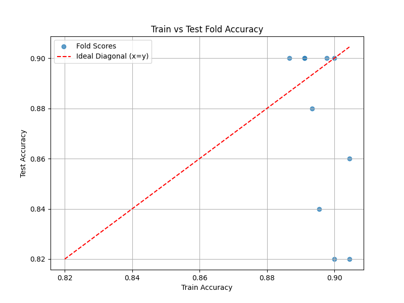
Compare Scores Visually
Assumptions
- Predefined Dataset Split: The training dataset is already split into train/test sets.
- Model and Metric: A single machine learning model and performance metric (e.g., accuracy, F1 score, RMSE) are defined for evaluation.
Procedure
-
Perform 10-Fold Cross-Validation
- What to do: Split the training dataset into 10 folds. For each iteration, train the model on 9 folds and validate it on the 1 remaining fold.
- Data Collection: Record the performance metric scores for each fold for both the training and test subsets.
-
Gather All Scores
- What to do: Compile train fold scores and test fold scores into two separate lists or arrays for analysis.
-
Create a Scatter Plot
- What to do: Plot the train fold scores on the x-axis and the corresponding test fold scores on the y-axis.
- Add a Diagonal Line: Include a diagonal line ( y = x ) on the plot to serve as the benchmark for perfect train-test performance alignment.
-
Analyze the Scatter Plot
- What to do: Compare the placement of points relative to the diagonal:
- Points on the diagonal indicate similar train and test performance.
- Points below the diagonal indicate higher train performance relative to test performance, suggesting potential overfitting.
- Points above the diagonal indicate higher test performance relative to train performance, which is rare and may indicate unexpected issues.
- What to do: Compare the placement of points relative to the diagonal:
-
Report Results
- What to do: Document findings with the scatter plot and a summary interpretation of point distribution relative to the diagonal line.
Interpretation
Outcome
- Results Provided:
- A scatter plot comparing train fold scores (x-axis) and test fold scores (y-axis), with a diagonal line representing the expected alignment.
- Visual representation of model performance consistency across folds.
Healthy/Problematic
- Healthy Indicators:
- Points closely aligned with the diagonal line suggest consistent performance between train and test data, indicating good generalization.
- Problematic Indicators:
- Clustering of points below the diagonal indicates overfitting, where the model performs significantly better on training data than on test data.
- Points above the diagonal are uncommon but may suggest an unusual pattern or potential data leakage in test folds.
Limitations
- Score Metric Dependence: Results depend on the chosen performance metric; other metrics may provide a different perspective.
- Data Distribution: Assumes the data folds are representative of the overall dataset; imbalanced or unrepresentative folds may bias results.
- Scalability: Large datasets may require computational resources for 10-fold cross-validation and plotting.
Code Example
This function performs k-fold cross-validation for a regression or classification task, gathers train and test fold scores, and creates a scatter plot to visualize their relationship.
import numpy as np
import matplotlib.pyplot as plt
from sklearn.model_selection import KFold
from sklearn.metrics import accuracy_score

def diagnostic_test_kfold(train_X, train_y, model, metric, k=10):
    """
    Perform k-fold cross-validation, gather train and test fold accuracy scores,
    and create a scatter plot to visualize the relationship between train and test scores.

    Parameters:
    - train_X: Numpy array of training input features.
    - train_y: Numpy array of training target values.
    - model: An sklearn estimator (e.g., LogisticRegression, RandomForestClassifier).
    - metric: Performance metric function (e.g., accuracy_score).
    - k: Number of folds for cross-validation (default is 10).

    Returns:
    - None. Displays the scatter plot and outputs findings.
    """
    kf = KFold(n_splits=k, shuffle=True, random_state=42)
    train_scores = []
    test_scores = []

    for train_index, test_index in kf.split(train_X):
        X_train_fold, X_test_fold = train_X[train_index], train_X[test_index]
        y_train_fold, y_test_fold = train_y[train_index], train_y[test_index]

        model.fit(X_train_fold, y_train_fold)

        y_train_pred = model.predict(X_train_fold)
        y_test_pred = model.predict(X_test_fold)

        train_scores.append(metric(y_train_fold, y_train_pred))
        test_scores.append(metric(y_test_fold, y_test_pred))

    # Convert to numpy arrays for easier handling
    train_scores = np.array(train_scores)
    test_scores = np.array(test_scores)

    # Plot train vs test scores
    plt.figure(figsize=(8, 6))
    plt.scatter(train_scores, test_scores, alpha=0.7, label='Fold Scores')
    min_score = min(min(train_scores), min(test_scores))
    max_score = max(max(train_scores), max(test_scores))
    plt.plot([min_score, max_score], [min_score, max_score], 'r--', label='Ideal Diagonal (x=y)')
    plt.xlabel('Train Accuracy')
    plt.ylabel('Test Accuracy')
    plt.title('Train vs Test Fold Accuracy')
    plt.legend()
    plt.grid(True)
    plt.show()

# Demo the function with synthetic data
from sklearn.datasets import make_classification
from sklearn.linear_model import LogisticRegression

# Generate synthetic classification data
X, y = make_classification(n_samples=500, n_features=20, n_informative=15, random_state=42)

# Define the model and metric
model = LogisticRegression(max_iter=1000)
metric = accuracy_score

# Run the diagnostic test
diagnostic_test_kfold(X, y, model, metric, k=10)
Example Output

A scatter plot showing the train vs. test fold scores with a diagonal line is displayed.
Key Features
- K-Fold Cross-Validation: Automatically performs k-fold cross-validation to gather fold-wise train and test performance scores.
- Train-Test Visualization: Creates a scatter plot with a diagonal line to compare train and test scores visually.
- Flexible Usage: Works with both regression and classification tasks using customizable metrics.
- Integrated Visualization: Combines numerical results and visual insights for a comprehensive diagnostic analysis.